Underscore Bells, freelance graphic designer and creative. Based in Naarm (Melbourne).
Projects
2022
Good Dog
Kallos Skincare
Acclaim Magazine
2021
Bells’ Burgers
Dreamscapes
Nectar Vinyl Covers
Sharp Boombox Render


Sharp Boombox Render
Services: Vector Illustration, 3D Rendering, Advertorial Promotion
Client: Bunnings Magazine (2021 RMIT University project)
Programs: Adobe Illustrator, Adobe InDesign
View original photo ︎
Target Audience
Client: Bunnings Magazine (2021 RMIT University project)
Programs: Adobe Illustrator, Adobe InDesign
View original photo ︎
Target Audience
- Homemakers and a market that is invested in home renovations
-
An audience that is interested in appliances and is technologically savvy
-
An individual who enjoys interior design and landscaping
- Family orientated audience
Project
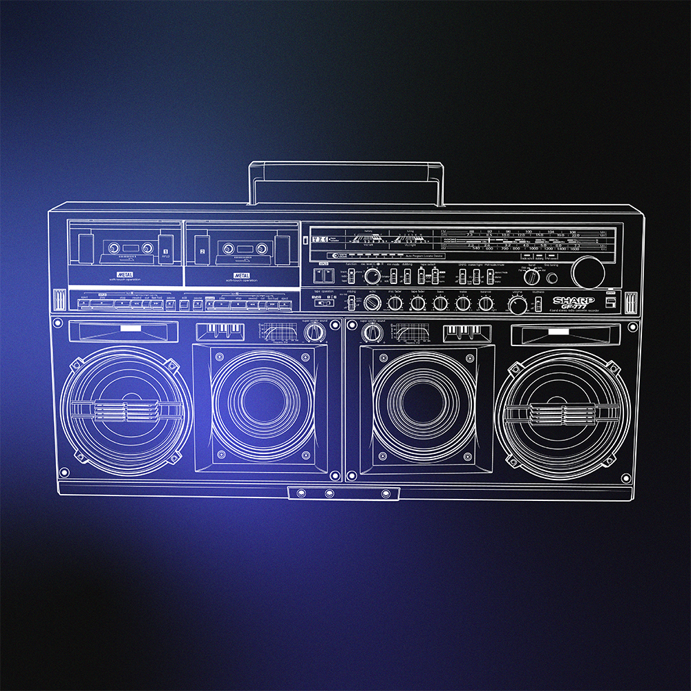
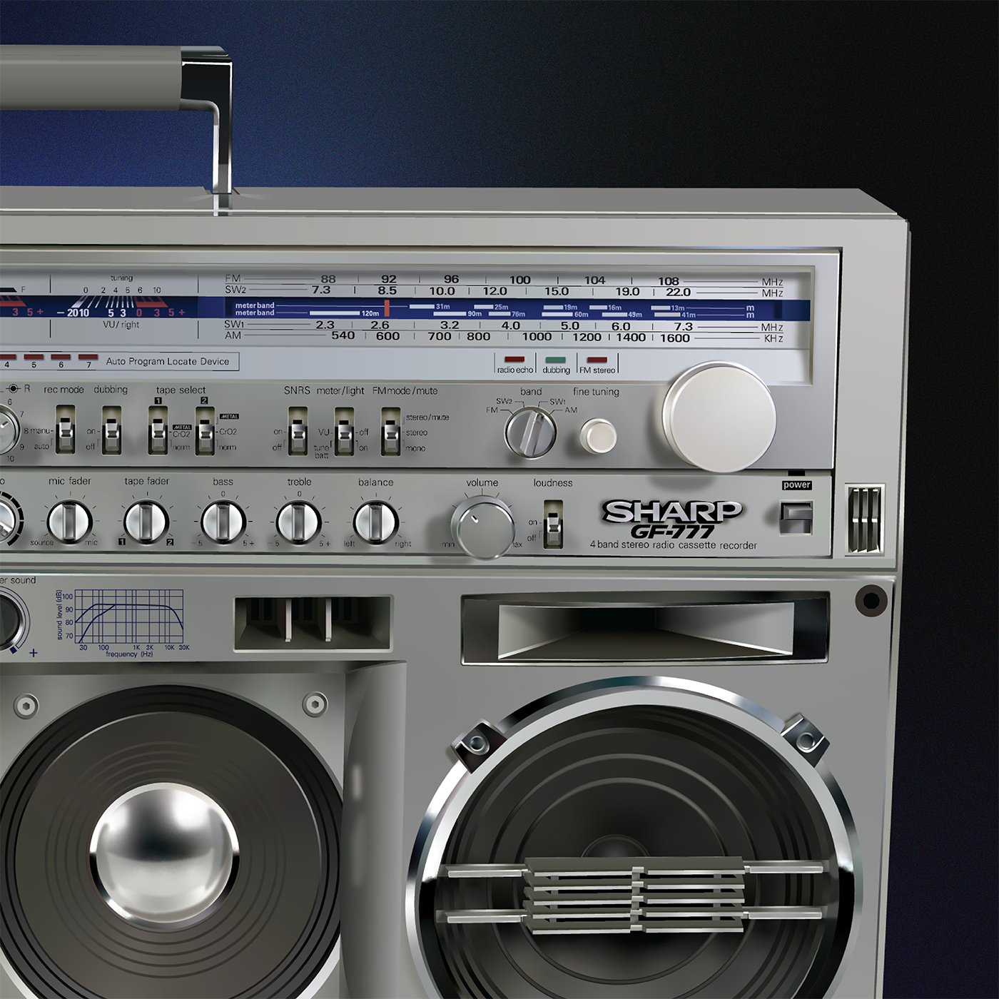
The brief for this project was to create a 3D rendered vector illustration of a product with the purpose of being featured in a press ad for Bunnings Magazine. I chose to illustrate a 'GF-777' portable stereo cassette player by Sharp Corporation. The illustration involved creating a technical line drawing and then rendering that with solid fills and free form gradients.
Once the technical illustration was complete, the next stage of the brief was to create an advertorial promotion layout for the object. I analysed the design needs by referring to the Bunnings Media Kit and sticking to those requirements. My ideas for the illustration and layouts were developed and refined by researching the Sharp brand and the Bunnings Magazine where the advertorial was placed. During this project, I demonstrated my ability to present my work as a part of the design approval process and gained feedback from my peers.
I wanted to create a clean and modern layout for my press ad, using light and pleasing colours to emulate that family friendly homeware magazine style. I noted that in most of the advertisements, the imagery was placed on top of the page with the text down the bottom which I reflected in my own layouts. Most of the press ads used images to span the width of the page. As I only had one image, I decided to try and replicate this style with blocks of colour in the background. I chose light neutral colours such as light blue, so they look like washes of colour and don’t take away from the illustration or text. For the heading, I saw a common trend of using a thin light sans serif typeface or a relaxed handwritten cursive font. I decided to combine the two for my heading to create some contrast.
3D Render


Line Drawing